Data Visualization Strategies For Investment Firms
Creating New Digital Experiences
Data has permeated every aspect of our lives in the digital age. It has become a crucial factor in shaping our online experiences and the insights we gain from it. As a result, companies relying on data visualization in brand and product marketing must continuously assess and improve the way they present information. This is particularly true in the investment and finance sector, where data-driven interactions often underpin the user journey as they analyze, compare and consume websites and marketing material.
In today’s market, asset management firms and financial advisory businesses must place a high priority on exceptional data visualization strategies. This is particularly crucial as audiences become increasingly discerning and sophisticated in their expectations. The digital experience has a direct impact on brand perception, which in turn influences the likelihood of customers using a company’s products and services. Therefore, the importance of implementing effective investment-related data visualization strategies cannot be ignored.
Fortunately, 2023 has brought with it new ways to showcase key information to ensure your investment firm marketing stands out in the marketplace.
A Digital Primer: Defining The Optimized Digital Experience
So, what is the digital experience? And how does it relate to your brand?
The digital experience is an interaction between a user and an organization that is made possible because of digital technologies.1
Pretty straightforward, but the critical question is, what should it ultimately accomplish?
The digital experience should be seen as a reflection, complementary element and support system to your brand’s engagement & interactivity with consumers.
Every investment company worth their salt has a unique product or service they have to offer, and with strong digital data presentation, they can be differentiated in various ways. Today we’ll go over three specific areas to focus on when considering how your investment products or financial services are showcased:
- Personalization & Interactivity
- Unique Visualizations
- Data Storytelling
We’ll be doing so primarily through the lens of the ever-important fund or strategy page. Yet these elements can be utilized across financial firm marketing, from about and culture pages to investment approach and ESG breakdown.
Data Visualization Tactics for Investment Firms
Investment strategy and fund pages in particular rely heavily on data to highlight and explain a firm’s products and strategies, as well as paint a picture of how effective they are. It is an absolutely critical aspect of the website, with great execution providing an avenue for consumers to view data breakdowns and performance in an easily digestible and highly impactful manner so they can get a better picture of firm thinking, communication and results. The ability to convey these components is essential in attracting and retaining business.
More specifically, it is the graphs and charts on those fund or strategy pages that gives site visitors the capacity to interact with the fund and therefore establish an immediate connection between the user and the firm. There are three different elements to the financial investment digital experience that can create a truly exceptional user journey: Interactivity, unique visualizations, and data-driven storytelling.
The ability to effectively convey firm thinking, communication style and results is essential in attracting and retaining business.

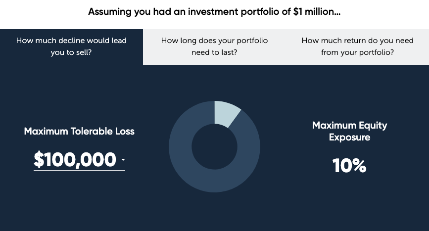
Chart Interactivity is one of the best ways to engage users in firm materials. This allows the user to have a hands-on experience that is memorable and impactful. Especially withing the invesmtent marketing industry, charts and graphs with motion and personalized elements can add context and opportunities to navigate questions that may arise while looking at data. There are a few different techniques and functions that can be used to make interactivity purposeful to the consumer such as the filter, sort and toggle.
Source: Buckingham Strategic Partners
In the above chart, the filter sort function allows the consumer to toggle between different questions and scenarios that they may have regarding that firm’s portfolios in relation to their specific financial situations. Other elements of chart interactivity such as a hover-over, changing the time frame, and the viewing of specific chart details further establish a connection between the user and the firm. Being able to home in on specific data allows the user to have full chart transparency and a user experience that is unique to each client.
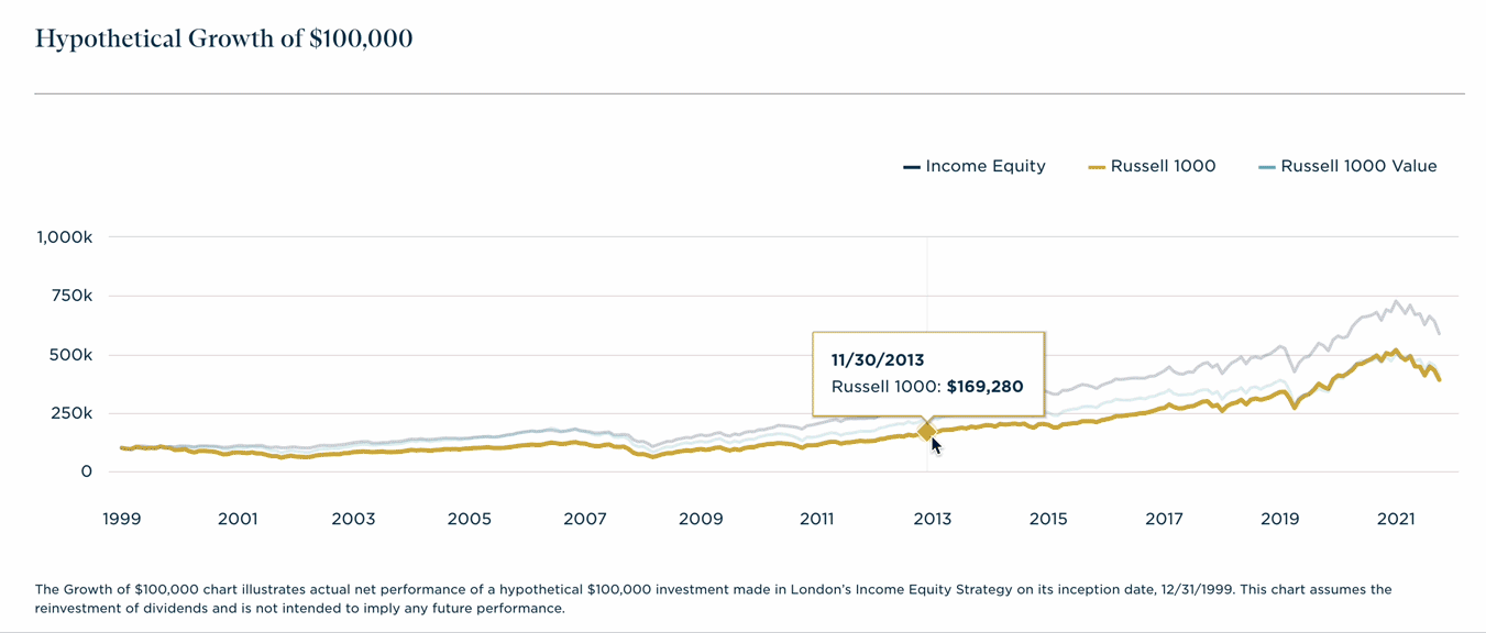
The same goes for investment product performance charting. If you can include elements that provide an added level of interactivity, the information will be more impactful. Showing relative performance through the use of easy to view charts, particularly ones that integrate brand identity, will create more memorable experiences.

Through modern financial website design and development tactics, data can also be viewed in a variety of shapes and sizes, leading to a further increase in user engagement. Utilizing different types of charts coupled with unique and interesting colors and forms can create an ideal user scenario.
The majority of charts found on financial investment websites include bar, line, pie, and scatter plots. And most that you find showcase data in straightforward, traditional ways. While straightforward is key, these charts can certainly be improved and iterated upon to make them more interesting to the user through enhance color choices and visual functionality. With most charts resembling others, presenting data in more interesting and aesthetic ways is a direct route to standing out.
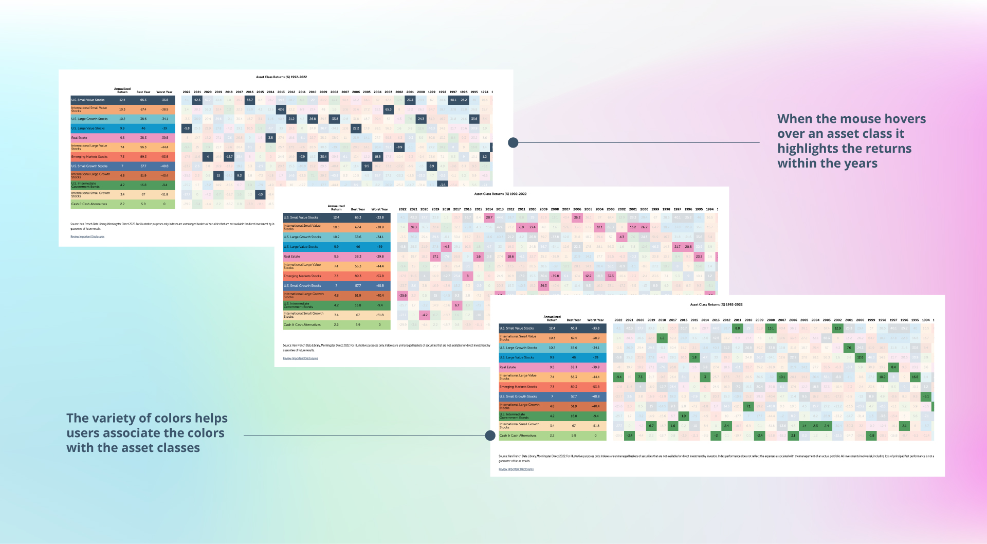
As you can see, in this graph the color usage not only draws the reader in, but also compliments the data, highlighting certain parts in brighter colors and ultimately calling the reader’s attention.

Data itself tells a story. Each data point contributes to a larger picture that the graph or chart is trying to convey. But without proper framing and flow, that picture will never be fully realized. This is where data storytelling comes in.
Data storytelling is the practice of framing data in a way that is easily understood by the user.
This entails gleaning the most important information and insights from a data set and providing a narrative. So, just like the thinking up an effective narrative arc, developing impactful investment website data storytelling parallels the element needed to create an actual story. The elements that require client base consideration include:
Characters
Who is impacted by this data?
Setting
Where does this data affect the client’s life?
Conflict
How can this data help solve or better inform our clients on a topic?
Resolution
Creating an informative narrative leaving clients more informed.2
This narrative can present in the form of highlighting specific metrics, changes in periods, and forming unique insights that the user can digest and utilize. Data storytelling makes data actionable. More specifically providing annotations, explanations, or an insightful message after graphs affords extra information to help explain what is happening.
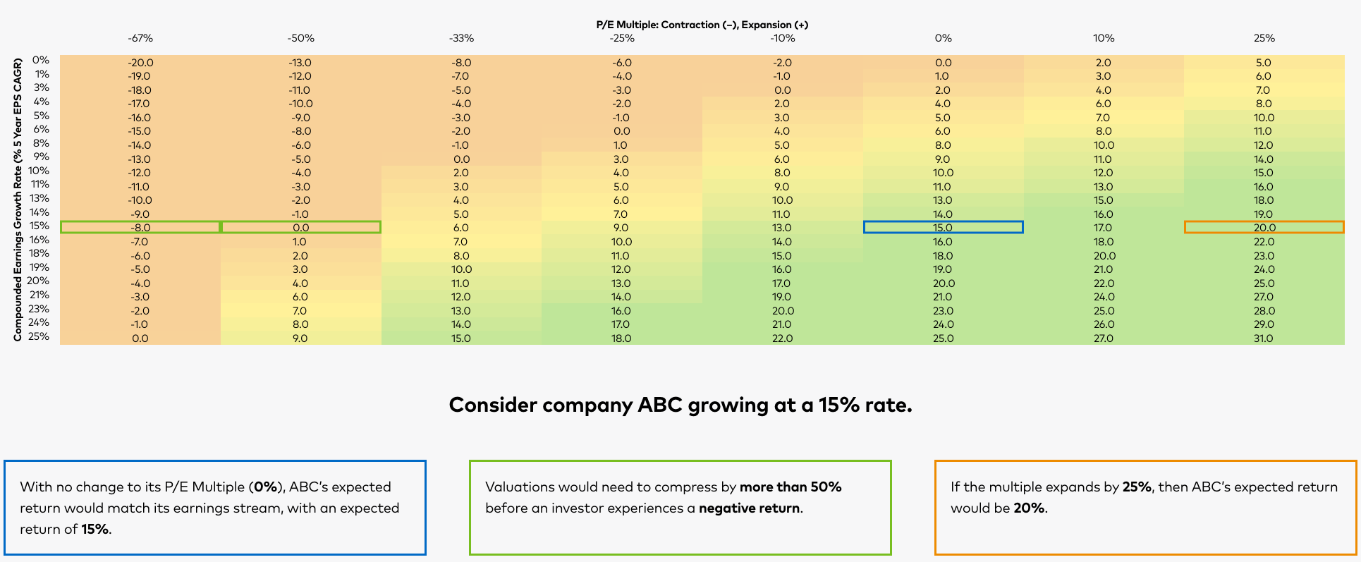
Beyond creating a better-informed user, data storytelling also requires the data visualization and/or interactivity to create not only a visual appeal but an emotional one too. How can numbers and data points be emotional? It’s all about the story that you create, and how it can relate to your client or target audience. Firms can stimulate the emotional side of their clients by highlighting patterns that relate to real-life scenarios, and ultimately persuade them to show that your firm is well-informed and prepared to invest intelligently while being a strong partner.
Strategic Storytelling & Visualization in Finance & Investing
The digital experience on firm fund pages and across the website have a massive influence on the users choice to ultimately work with your firm. Our world has always been driven by data analytics and now firms have the ability to present that data and those insights to provide an immersive and value-added digital experience for the stakeholders—be it potential clients, acquirers or investors—needed to take your firm to the next level. They want to feel informed and confident, and your data story is the key to unlocking these emotions.
MBC has worked with a wide range of investment firms and asset managers who have grown both from their willingness to think differently about their own investing, but also the way they present it. Contact us to learn more about how we can help your firm take the next step.