Venture Capital Branding: Web Design Trends For 2023

As the industry continues to evolve, venture capital branding and digital presentation have become increasingly important for VC firms and private equity funds looking to improve their web design practices and stand out in a rapidly shifting and highly competitive marketplace.
Historically laser-focused on simply showcasing deal flows to attract both talent and founders, prior versions of venture firms rarely needed to go much further than that to attract stakeholders and continue building investment portfolios. This has changed, and VCs can no longer continue to solely rely on their past successes to prove future value in their marketing and branding efforts.
In order to win over key talent and innovative founders in 2023 and beyond, venture capitalists must place more emphasis on their story, their vision, and how they collaborate with and support the teams who dream up the ideas they invest in. This all starts with a compelling online persona and web presence that provides a multi-dimensional showcase of both who you are as a venture firm and the platform you provide to founders seeking the most effective launch pad for their startup.
Equipped with a fully formed venture capital brand identity, design framework and website design, firms can massively reduce the time sink related to talent acquisition and focus more resources on what matters most — building optimized investment portfolios.
Simply put: the better the brand presence, the more attractive you will stand to modern, entrepreneurial talent and tomorrow’s investors.
But how does brand and communication design achieve this? And how can venture capitalists attract greater value through their websites, while positioning themselves favorably against competitors? To answer this, we dive into the importance of both brand strategy and web design by considering the following areas that are critical for long-term success.
Your venture capital brand is more important than ever
Creating a strong brand and website requires more than consolidating a bio and portfolio. Modern branding and web design provide a window into your firm’s value-add by directly addressing the audience and their needs. This is especially important today as a curated web experience can not only make or break a deal, but also do a lot of the selling for you.
Since the early days, VC success has commonly boiled down to smart networking. While this is certainly still a huge part of the puzzle, the positive digital optics that comes from high-quality branding and web design have risen greatly in prominence.
In a discussion about the changing environment for VCs and their audiences, Naval Ravikant, CEO of Venture Capital platform AngelList, notes “proprietary deal flow is dead.” Today, VCs instead have “proprietary access,” or the ability to access a deal. This means that more deals today have greater competition, requiring investors and other venture capital firms to compete by leveraging their experience, network access and, most importantly, their brand.1
As explained, investing in your brand is key in creating leverage over your competition. Today, this begins with a well thought-out and creative website. Not only does your website communicate a level of quality that reflects the identity of your brand, but also an immediate proof that you are worth your partners’ time and energy.
The modern founder wants an equally modern partner — one with the sophistication and resources needed to compete and thrive in the startup space. They are looking for a supportive, transparent and accessible partner who respects their ideas, while putting in place a clear system that allows them to realize their true vision.
Creating a Venture capital website that leads by example is critical
Like most digital natives, today’s entrepreneurs and investors spend countless hours online. Surveying competitors, exploring new trends, and understanding the industry landscape is simply part of the process now. This makes your website a much more fundamental factor in standing out.
So, what are the key elements of strong web design for venture capital firms? The answer can be boiled down to two key areas:
- Emphasizing familiarity with (and acceptance of) innovation, creativity & design
- Showcasing a fertile start-up ecosystem environment for founders
Innovative Web Design = Innovative Venture Capital Firm
Founders, investors and even those reporting on the venture capital industry, are looking for VC firms that understand and respect innovation while showing that they can also be creative thinkers who can provide more of a value-add that the capital itself.
Venture firms that have a distinct style with the ability to convey a sophisticated future vision through compelling design will be rewarded by stakeholders who want like-minded, yet highly capable partners at their side. At an industry level, this design flair can also bring more press, site visits and general brand awareness by attracting those who cover the space, such as reporters and trade writers.

It’s Also About the Founder Experience
In addition to investors, a key target audience for most VC web sites is the highly sought-after founders themselves. Top talent is being inundated with meeting requests and funding offers, making the modern vetting process a “bidding war” unprecedented in the space until recently.
This requires new ways to showcase the founder experience and venture partnership that they receive when aligning with your firm. By providing a more in-depth look into what the founder should expect, how the firm works with their start-ups, and all the resources they have access to, will go a long way in selling them on your value proposition.
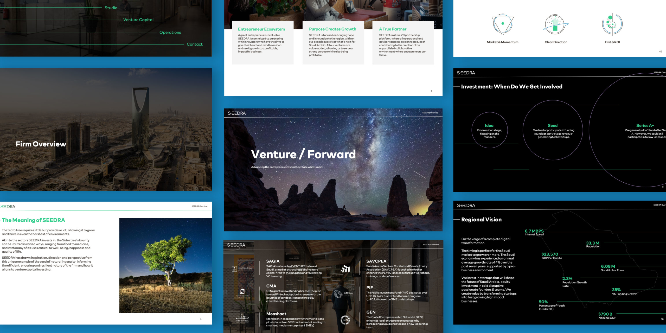
A recent example is SEEDRA, a Saudi-based VC and Venture Studio firm. By visualizing and expanding on the founder experience at all stages of the start-up process, SEEDRA was able to convey their value proposition of a truly supportive partnership effectively to talented founders seeking someone who understands their perspective and can help them accomplish their objective without the traditional barriers that limit or undermine their vision.

MBC recently helped venture capital firm, SEEDRA, develop their website and redefine their brand identity. To learn more, and see further venture capital work by MBC Strategic, click HERE.
The Raw Materials for a Modern VC Website
While there is a great deal that goes into updating and rebranding venture capital firms, there are critical elements that should be included to create a modern brand presence and website design for venture capitalists. Here are a few categories (and accompanying suggestions) to explore:
Video
Consumption of video content has risen dramatically in the past decade. Clean, aesthetically pleasing and inspiring motion content on a website can attract eyes, convey important information and ultimately foster memorability. Examples include:
- Full screen landing splash video that conveys vision and values of VC firm
- A founder interview talking about their experience building their company
- A start-up case study showing the VC resources they utilized to get off the ground
Animation
As investment web development options increase, venture firms can utilize previously more accessible design elements, such as animation. Versatile and differentiating, animation can provide unique ways to convey process or value. This can be done in either a sophisticated or slightly playful way, as VC firms are less obligated to stay more “buttoned-up” like asset managers or other investment fiduciaries.
When executed effectively, animation can lend a brand further rapport in appealing to audiences that are familiar with, and therefore open to unique and interesting design. Examples include:
- Visualizing value drivers through motion icons
- Step-by-step start-up process
Data Visualization
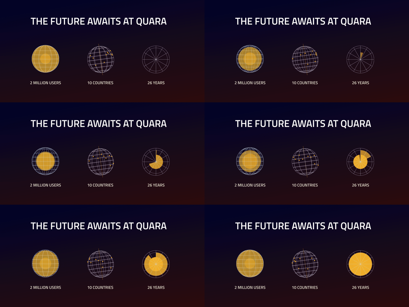
A visual design trend increasing in popularity, scrollytelling is a site feature with a mixture of interaction and animation that is proving useful to investment brands seeking to tell data-driven stories in engaging ways. Considering that numbers and results are a critical aspects of VC brand stories, it is important to find an effective way to convey these statistics without drowning the audience in static data.
Scrollytelling brings together a modern and intuitive site experience with quantitative information deployment by animating in key numbers and value drivers as the user scrolls down a page. This helps emphasize the most important info while ensuring it is still easily digestible. Examples include:
- Firm history & funding timelines
- Featured start-up case studies
Upgrade your venture capital brand
When it comes to venture capital branding, evolving your look and incorporating modern design trends into your website is the easiest way to stand out. As a brand, taking what works and building new approaches tells clients that your firm is not run-of-the-mill – but is in fact a leader in a hyper-competitive industry.
This means a great deal to modern audiences, and if carried out effectively, innovative branding and web design not only tells a distinctive narrative to talent, founders, investors and industry insiders, it helps create a market advantage that is critical to long-term success in this new era of digital engagement.
If you are interested in learning more about website design or creative branding for venture capital firms, get in touch, or check out the MBC Strategic portfolio here.
