5 Website Must-Haves for Investment Companies
What’s the first thing a potential client does when they’re curious about your investment strategy? They visit your website. As the digital face of your firm, your website is the first impression for a huge percentage of your prospects, and can uplift or cripple your business development. Many asset managers even utilize automated phone messages directing traffic to their website as an alternative solution, when necessary. A great site can complement your customer service efforts. Better yet, a well-designed asset management website can pack an extra punch in providing a great client experience.
It is hard to argue against the idea that a good website is absolutely essential to financial services and investment managers today. Industry giants are constantly retooling their websites for optimal branding, but even small asset managers can differentiate themselves with the right digital marketing.
But what elements are the most important for growth? Is style more important than function? Our experience in investment management websites and branding has helped us compile a list of must-haves for asset managers, and financial/investment service companies.
1. Intuitive Navigation
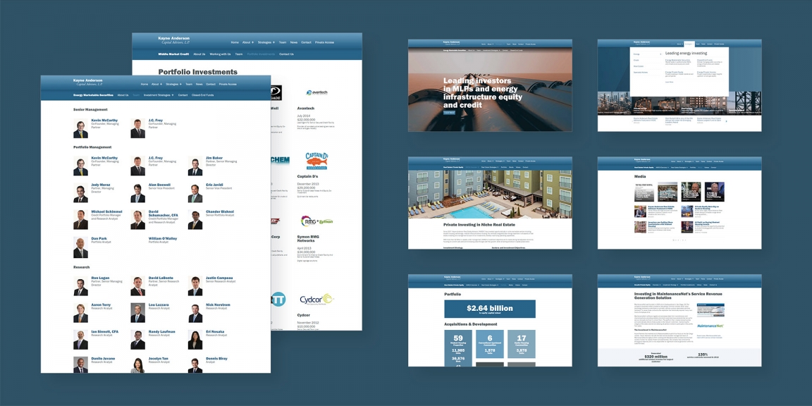
Digging through a disorganized investment website to find information is frustrating. Making your site easy to navigate is crucial to a great client experience. A well-designed investment website incorporates effective user experience design—or UX—for your audiences, leaving your visitors satisfied that they came. Though all visitors are different, investors, advisors, or institutional partners are almost universally looking to understand in your firm’s strategy, unique story, fees, and value proposition. Is this information easy to find on your site within 2 or 3 clicks?
No matter how simple or complex your site may be, all web content needs to be well arranged. Web developers who are also UX designers make a world of difference in this regard. Simple components such as anchor links and sub-navigation elements can keep even the most multifaceted investment-related webpages organized and ordered properly. In addition, make sure to put a lot of time thinking about how people might interact with each element of your investment website, and what information might me critical to visitors.
There are numerous studies that show that the average attention span of a new website visitor is short. Some researchers suggest most visitors spend less than 15 seconds on your site[1]. Many years ago, it was concluded that a website has roughly 59 seconds to keep a visitor’s attention.[2] At any rate, your engagement window is small, and quickly delivering prospects the information they seek, will score a big win for your brand.
Your website’s navigation should incorporate the most frequently demanded pages on the site. Pages should also be specific to your industry and audience. In many companies, information about your firm, team, and contact information should be clearly defined and only a click away. Pay extra attention to your about page and copy as well – an about page is your opportunity to connect to clients with your unique story, voice, and perspective, and how the combination of these differentiators inspires your strategies.
Understand your target audience. This is a critical factor when designing your website. Are your clients individual or institutional investors? Are they small business owners or intermediaries? Keep your target audience in mind when crafting your pages, and anticipate what your visitors are most likely interested in. Use your website as a funnel that moves investors along each step of the sales process, from the awareness stage to the decision stage. A well-organized site layout with clear, logical page flow adds an additional asset to your business development efforts.
2. Adaptive and Responsive Structure for Mobile Users
Once you have nailed down your site’s navigation, it’s important to test your website on multiple devices. Whether it’s the newest iPhone, or Samsung tablet, visibility across different technological standards is important. Last year, mobile search accounted roughly for 58% of overall search query volume.[3] More than ever, your existing and future clients are viewing your website on smartphones and tablets, making optimization for all devices paramount for your clients.
Responsive web design is the recommended design pattern by Google[4]. As a proof point, your search engine ranking on Google is heavily influenced by display adaptability. A non-adaptive website can limit your search engine ranking, and cripple your web traffic growth.
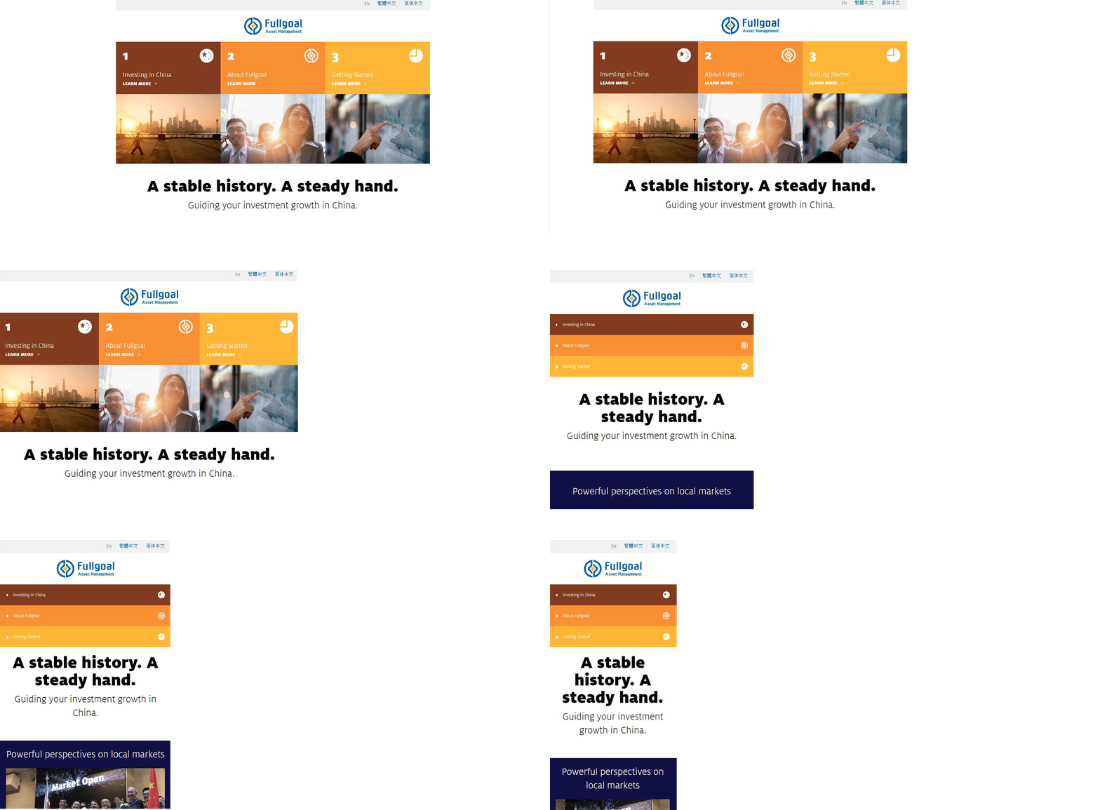
If you are reading this article on a desktop or a laptop, here’s an easy way to test how your site can look on different devices: undock this screen in your browser, allowing you to manually adjust the width of the window. Place your mouse arrow right on the edge of the window, the arrow pointer should become a horizontal double arrow. Now, click and hold the mouse button and adjust the window to become smaller and smaller. How does your website content look at half the width? How about a quarter of the width? Is your text and imagery jumbled or still organized? This is the likely the way it appears to smartphone and tablet users. Keep in mind the way your website looks at different screen widths, as this well optimize your investment website for mobile viewing.
A Case Study in Responsive Investment Website Design
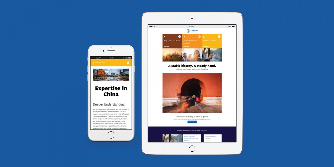
Fullgoal, one of the largest asset managers in China, wanted to leverage its history and strengths in offering Chinese investment solutions to the largest institutional investors across Europe and Asia. MBC Strategic sought to leverage and highlight Fullgoal and China’s rich history and reputation of guidance and protection throughout the brand, message, and design, crafting a modern and punchy messaging and design in the process, designing and developing the Fullgoal multi-site company website. The mobile-adaptive looks great on any device, and supports traffic from a global audience.
View the IMA Winning Responsive Website Design and Development Project
3. Meaningful Design Elements
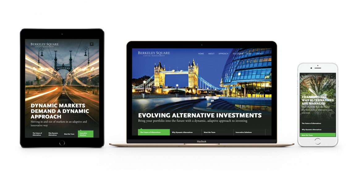
It’s not necessary for your investment website to reinvent the wheel on design. Even so, being thoughtful on certain website components can elevate your visitor’s experience. While some of these elements seem simple, missing the mark can negatively contribute to your website and increase your bounce rate.
Page Flow
Presentation is just as important as information, and your website is no exception. Your site hierarchy—or arrangement and design of key elements to convey significance, intuitively leads your viewer’s eyes to the important features of your website. This applies to text, imagery, and layout.
Studies show that web users roughly follow an “F” pattern when viewing text-heavy websites like blogs, looking for points of interest and keywords. In other cases, users follow a “z” when web pages aren’t only text focused.[5] Knowing this can help you effectively place key site elements, with the right balance of page scale, and hierarchy.
High Quality, Relevant Imagery
Take a quick inventory of your site’s imagery. Is it relevant to your target audience? Does it represent your firm’s essence or aesthetic? Are your images similarly colored for consistency? This is a major step in developing your brand, re-inventing your firm, or launching a new product or service. Creating or enhancing your identity does not only include imagery, but focus on color palette and icons as well.
To effectively use imagery, think about what resonates with your target audience and relates to your firm’s unique story. Add some whitespace around your site’s images to encourage focus. Stock photos can get the job done, but photos with real people showing authentic emotion will likely resonate with your audiences more. They assist in the development of your firm’s brand, and when the correct images are selected, they resonate and can transcend even language barriers when approaching potential international clients. The right visual pairing should evoke a visceral feeling that accentuates a firm’s values, making it a powerful tool to messaging.
This can be tricky, but finding imagery that isn’t stiff, too obvious or used by everyone else is essential to differentiation. Also, ensure that your images have a sufficiently high resolution, meaning it won’t appear blurry or stretched when displayed online. Just don’t overdo it when adding high resolution imagery to your site—especially on your home page. Overloading a high traffic page with heavy imagery and other content can significantly increase loading time for users.
Solidifying your corporate identity with the use the right images can evoke an automatic response to your client base. When you have a package of the right message and materials, this will create interest, drive new business, and develop customer loyalty.
Typography and Font
Visual preference varies from person to person, but, consistency goes a long way. Use a font family or two that are on brand for general uniformity, and delineate sections by boldness. Capitalization, likewise, should be consistent across your investment materials and financial services website. If you produce printed editorial content in addition to web content like magazines, utilize good design principles to capture and keep your viewers’ attention.
For content that visitors will view on a screen, a smoother, san-serif font might be more pleasing to the eye. For brochures and other printed documents, serif fonts with distinctive letters visually resound better, and are easier to read. Why? Printed documents generally have a resolution around 1,000 dots per inch, while monitors and smart phone screens on range from 100-300 dots per inch, much less than print. For lower resolution, a smoother, simpler font should make reading easier for the viewer’s eyes.[6]
Calls-to-Action
The right call to action can be the launchpad for a conversion for a new client. To create effective CTAs, your visitors must be able to spot them quickly and without effort. This makes copy, design, and placement all important to inspiring viewers to take action. The CTA—likely a button or clickable link—should naturally stand out by its color, size, or placement, without being an eye-sore. It should be a tool in easing the sign-up process for visitors to learn more about the firm or contact directly, with just a few clicks.
4. Your Insights and Commentary
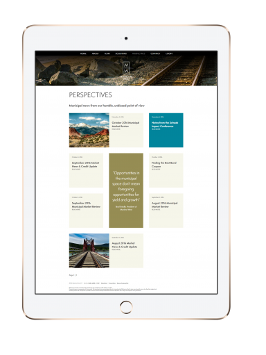
Great content serves you and your audience tremendously. It gives you the opportunity to share your unique perspective on your industry. It also offers actionable advice to visitors.
Content marketing attracts visitors organically to your investment website through a process called search engine optimization—or SEO. This makes your site more visible in relevant queries on Google, Bing, and other search engines. An insight, or news page on your site opens the door for engaging content, and this type of thought leadership can be the key to winning over new clients.
Today’s technology makes knowledge sharing even easier, and can go beyond traditional blog posts. If you have the bandwidth, podcasts, webinars, and even SlideShares are excellent mediums with which to engage your audiences—with potentially strong benefits. Placing your firm on the forefront of your investment industry niche through research and timely market commentary can naturally communicate your unique selling points. Educational cont by delivering your message to the right audience, at the right time.
5. Web Analytics

To assess whether your website supports or detracts from your business, it is vital that you have the capability to measure your web traffic. With Google Analytics, you can get a full breakdown of user behavior on your website and drill down to the fine details.
Analytics has a full arsenal of actionable metrics, including what pages are the most popular by views and by time spent (down to the average second), and what keywords brings the most traffic to your site. These tools will help you effectively measure and report all web traffic, rather than playing a guessing game. Handy metrics like session duration can measure how much time visitors are spending on your webpages. Other metrics can measure fine details like first time versus repeat visitors, entry and exit pages, and what device they used to view your site.
Asset managers can effectively generate brand awareness by targeting specific search inquiries using non-branded keywords, like “structured credit mutual fund”. When someone searches the phrase, your website should come up – this is where search analytics provide an advantage. This actionable insight would be unknown without the help of research-driven analytics.
When you decide to make changes to your website or your marketing mix, you can use website analytics as evidence to determine whether your changes and new strategy directly changes user behavior, and whether it changes for the better or for the worse. This can help your marketing team secure stakeholder buy-in.
Incorporating these must-haves on your website can boost your brand and assets under management with the potential to grow your client base to position your firm from your competitors.
Contact MBC Strategic to see how your firm can benefit from our investment industry expertise and extensive marketing experience.
- Hubspot, Ginny Mineo, 2014
- Nielsen Norman Group, How Long Do Users Stay on Web Pages, Jakob Nielsen, September 2011
- Hitwise, Mobile Search: Topics and Themes, John Fetto
- Google, Mobile SEO Overview, July 2017
- Creative Bloq, How the human eye reads a website, November 2014
- Scribe Consulting, September 2017
Published:
Tags: alternative investment branding and marketing, Financial Services Design, financial services marketing, financial services web design, financial services website design, investment website content development, investment website design, mutual fund website design, private equity fund website, REIT website design, website design financial services, website design for a private equity fund, website for alternative investment firm