Data Visualization in Financial Investment Marketing and Communications

How Financial Charts Can Be an Important Communication Tool for Your Firm
Financial information has a well-earned reputation for being difficult to digest. While the Quants out there can breeze through quarterly reports and fund performance metrics with ease, the majority of individual investors and clients are not so savvy when it comes to reading and analyzing financials. This is where charting comes in.
Financial charting is an invaluable asset for investment managers and firms, helping condense critical information for maximum impact. Charts can even go so far as to clearly lay out a compelling, visually-appealing financial story that is derived from the data and insights gathered.
93% OF ALL COMMUNICATION IS VISUAL
Simply put, by using charts as a data visualization tool, you can help your audience process information quickly and easily. This utilization of visual data is especially important considering that 93% of all human communication is visual . Visualizing data in the form of charts will also ensure that your audience understands and retains the information they’re presented.
This article will demonstrate why it’s important for financial services marketers to use charts.
Why use charts?
Charts take out the heavy lifting of digesting data
Relying on data alone makes it extremely difficult to provide your audience with important insights or highlight relevant trends. The data must be organized and analyzed in a digestible way to be of any significant value to the vast majority of clients and investors. The most impactful charts are those in which the data is presented in a manner that effectively enhances the audience’s understanding of the underlying numbers. This can dramatically improve the ability for your audience to comprehend and interpret the data they’re given.
The use of design-forward charts can also help emphasize differences, similarities and highlight trends within the data sets. By taking a large amount of information and breaking it down into a visual representation of quantified data, you’re giving your audience a user-friendly easy way to understand the information. In doing so, the core message you are trying to convey is bolstered by visual illustrations, resulting in an even clearer financial picture, along with the goodwill generated by demonstrating a focus on the user experience and commitment to your message.
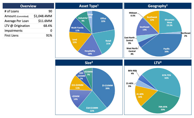
A prime example of expertly utilizing charts to create digestible data and valuable insights can be seen with the updated charts that MBC Strategic developed for Calmwater Capital. As you can see, their original firm overview contained four pie charts depicting product type and geography, size, and loan-to-value percentages. This is all vital information for investors, yet it can be difficult to navigate and ultimately digest. There are key terms in the overview and in the charts themselves, sometimes overflowing outside of them, leading to a confusing user journey where all the information blends together.
previous
redesigned
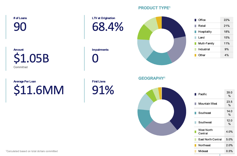
MBC designers saw this as an opportunity to simplify and streamline. And the result is a halving of charts and a more efficient display of information. By converting a large amount of data into two compact visualizations with key statistical call-outs, audiences can more easily wrap their heads around the data.
The colors of the pie chart delineate each category while the information and data from those categories is clearly stated on the right. As can be seen, there is much less “going on” in the second version, yet it better communicates the information and data to the audience in a simpler, and much more aesthetically-appealing fashion.
Charts can help cultivate strong brand identity through colors and design
Another way charts support financial services marketers is that they can utilize several colors of the brand, which helps cultivate and reinforce brand identity while also providing key information. This can have a lasting effect, as the user is going to equate your brand colors with useful information going forward.
Many brands have palettes of six or more colors, meaning one chart could realistically incorporate all accent and base colors. On a firm’s website, you’ll typically see their colors throughout the site but seeing them all together in a chart bolsters their brand identity in a unique and subtle way. This illustrates a more unified brand identity – all while communicating your message.
This demonstrates brand cohesiveness to your audience and subtly highlights your creative edge. When information is presented this way, data is more interesting, digestible and visually appealing.
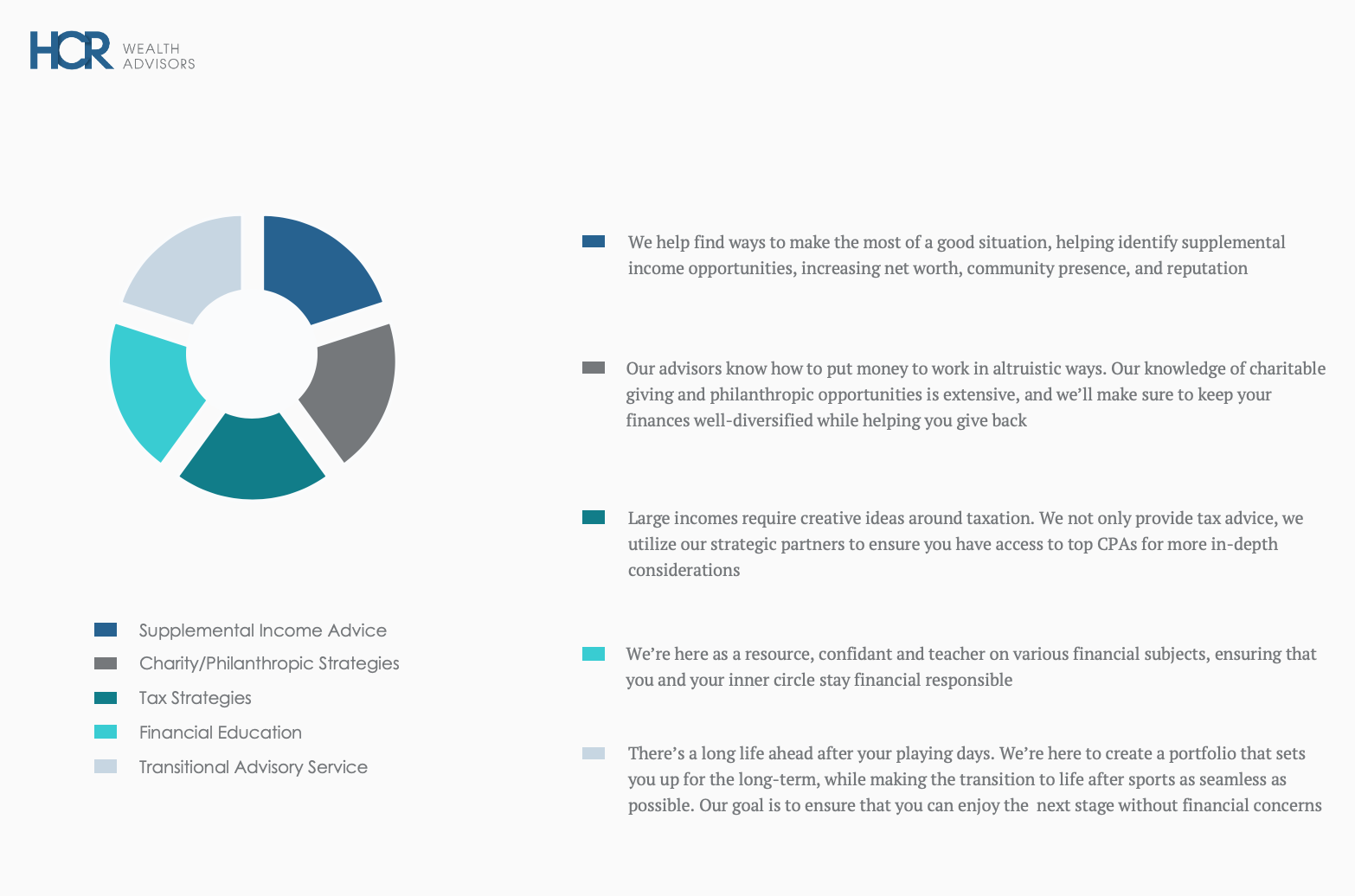
In the case of HCR Wealth Advisors, a Los Angeles-based financial planning firm, MBC Strategic created a pie chart that makes use of their entire spectrum of accent and base colors to present information in a way that is cohesive and polished. This ties the HCR brand together across their website and marketing material, providing the user with a familiar experience, which greatly boosts brand recall.
Charts give you the opportunity to show your modern edge
Brands that come across as forward-thinking and innovative have a substantial advantage in optics over the competition, and charts can help immediately convey this modern edge. This is an opportunity for you to show that you know how to successfully interpret and visualize the data presented so that it’s communicated effectively and easily to your target audience.
The setting and typography of a chart are two primary ways to elevate your content and project your message in a way that comes ensure it comes across as modern and polished. For example, dark colors paired with strong fonts convey seriousness and authority, while neutral colors paired with clean fonts convey a more progressive vibe.
Incorporating a relevant image, setting or theme in the background of a chart can help further demonstrate a firm’s modern edge by adding depth of brand personality and identity. The use of a backdrop illustrates that a firm understands aesthetics and can connect the bigger picture to their findings than just what the numbers convey. By utilizing these themes effectively, you can show why you’re more sophisticated than the competition while demonstrating the ability to interpret data successfully and concisely.
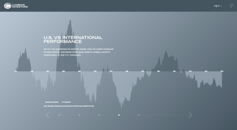
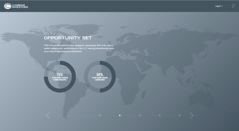
For Cambiar Investors, we helped create charts that not only highlight critical information, but also play with backgrounds, shading, and powerful colors to evoke a sense of sophistication and control.
The background image in the pie chart, for example, calls attention to Cambiar’s international presence and helps bolster the globally-driven information from the chart. The image backdrop combined with the monochromatic tones of the chart accentuate their modern, future-forward presence.
As you can see, charts are a particularly important communication tool for financial services marketers who rely on numbers to convey some of the most important value drivers of their firm. Your ability to effectively employ charts can place you in front of the competition and serve as an opportunity to show how you can make data interpretation both interesting and in-line with your brand identity.
To learn more about how MBC Strategic can improve your financial and investment marketing and branding solutions, please, give us a call and contact us today.
- Pant, Ritu “Visual Marketing: A Picture’s Worth 60,000 Words” business2community.com, January 16, 2017
Published:
Tags: Award winning marketing agency, data visualization in finance, financial brand marketing, financial charting, financial firm content writing, financial firm pr, Financial institutions SEO, financial marketing millennial, financial services industry marketing, investment industry marketing, award winning advertising agency, award winning financial service marketing, branding agency with investment experience, branding for investment industry, investment brand strategy, investment marketing and branding